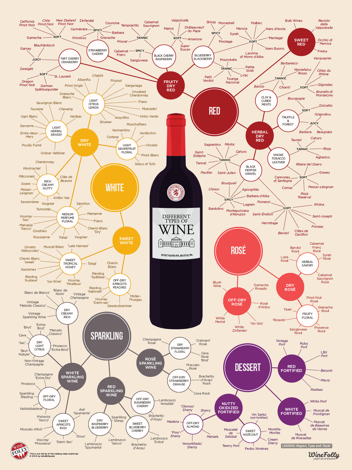
Originally posted in 2012 and updated in 2020, the Seattle-based wine blog, Wine Folly, created the ultimate guide to wine. For ease and education, Wine Folly uploaded an infographic (as seen above) to visualize 200 types of wine by style and taste.
An award-winning author. 2019 Wine Communicator of the Year. Co-founder of Wine Folly. With over 27,000 followers on Instagram, Madeline Puckette conquers all as the queen of wine blogging. As the creator of this infographic, Puckette focused on including types of wine by style, then primary flavor, and additional groupings of high tannin, round, or spicy.
A Learning Lesson

Packing big amounts of information into a small space, infographics can be used in a variety of fields to combine visual elements with education. As Puckette does in the image above, infographics are used to present information to the reader in a unique format, rather than bullet points on a document. Within any field or topic, information can be difficult to understand. With visual communication tactics, a reader can digest and comprehend the information presented in a simple way. With a large, daunting topic such as types of wine, people who want to learn more about flavor profiles can utilize an infographic like Puckette’s without feeling overwhelmed.
Did You Know?
The human brain processes images and visual details 60,000 times faster than text/words, so a picture is worth more than 60,000 words.
According to Zenesys, there are 7 reasons why infographics are crucial in communications:
- It grabs viewers attention faster
- Proves expertise
- Makes complicated information more understandable
- Boosts brand value
- It makes content go viral
- Search engine optimization
- Shareable

Visual Communication from the Wine Industry
Check out successful infographics in the slideshow below for more examples:


